
About the Project
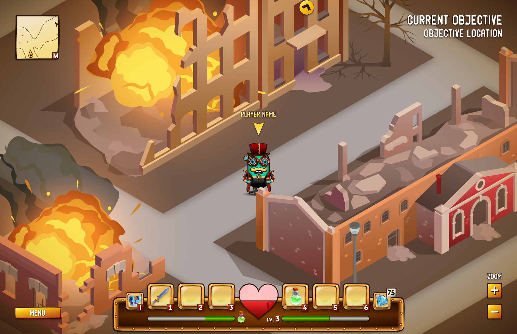
The aim of this project was to experience the UX and UI design process while working with Minecraft Dungeons. Eventually, I intended to produce a case study that features refined wireframes and UI mockups created through multiple iterations.
Responsibilities
UX/UI Design
UX Researcher
Quality assurance
Deliverables
Player Journey
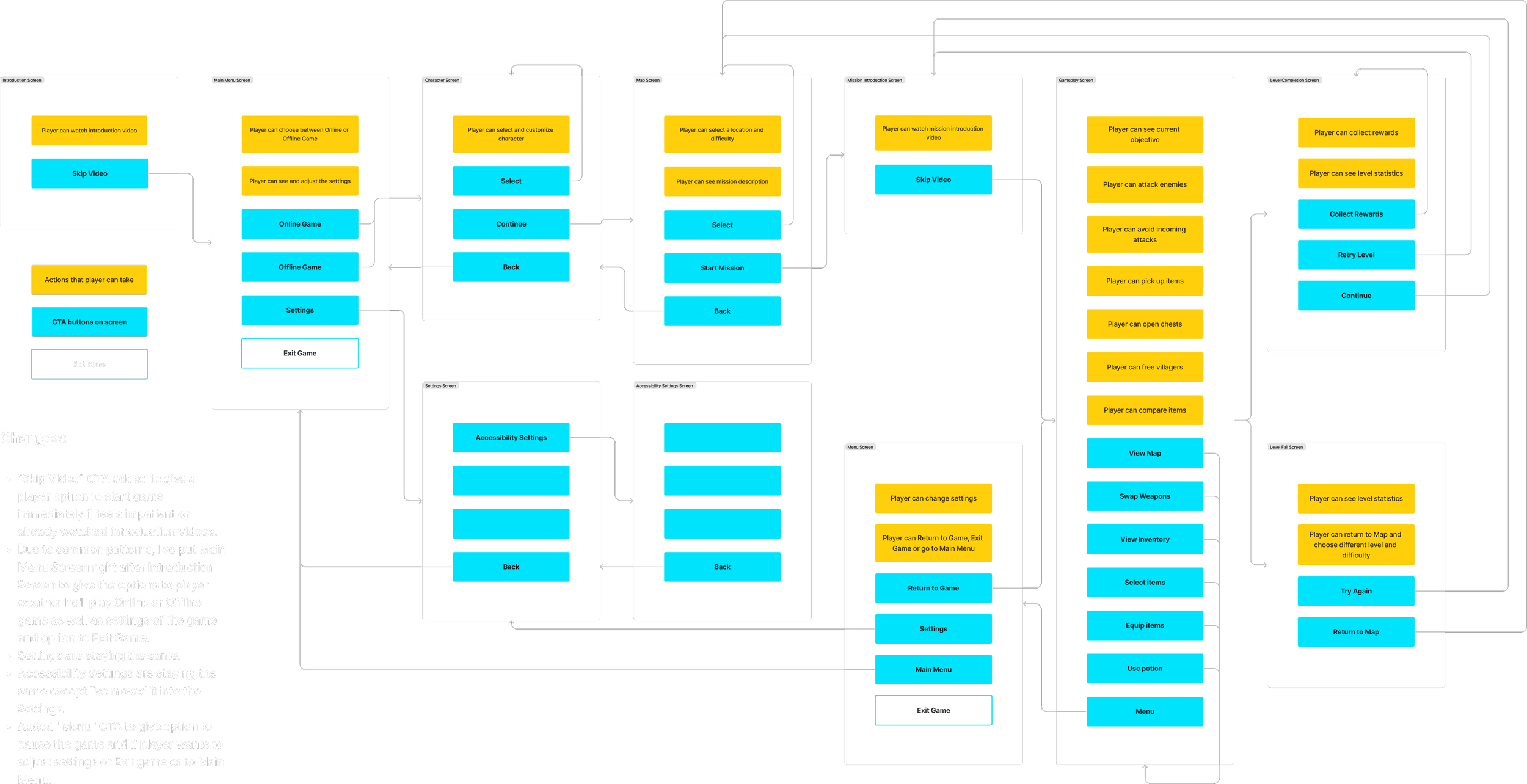
Flow Chart
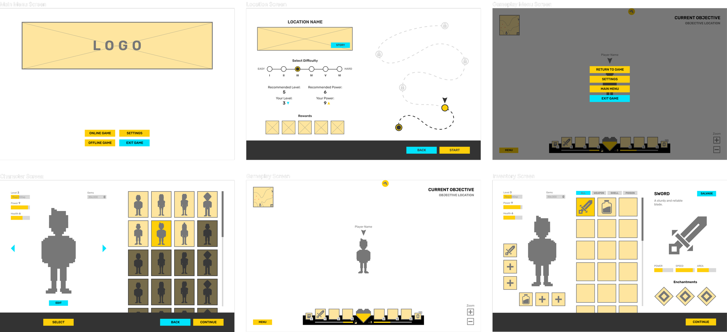
Wireframes
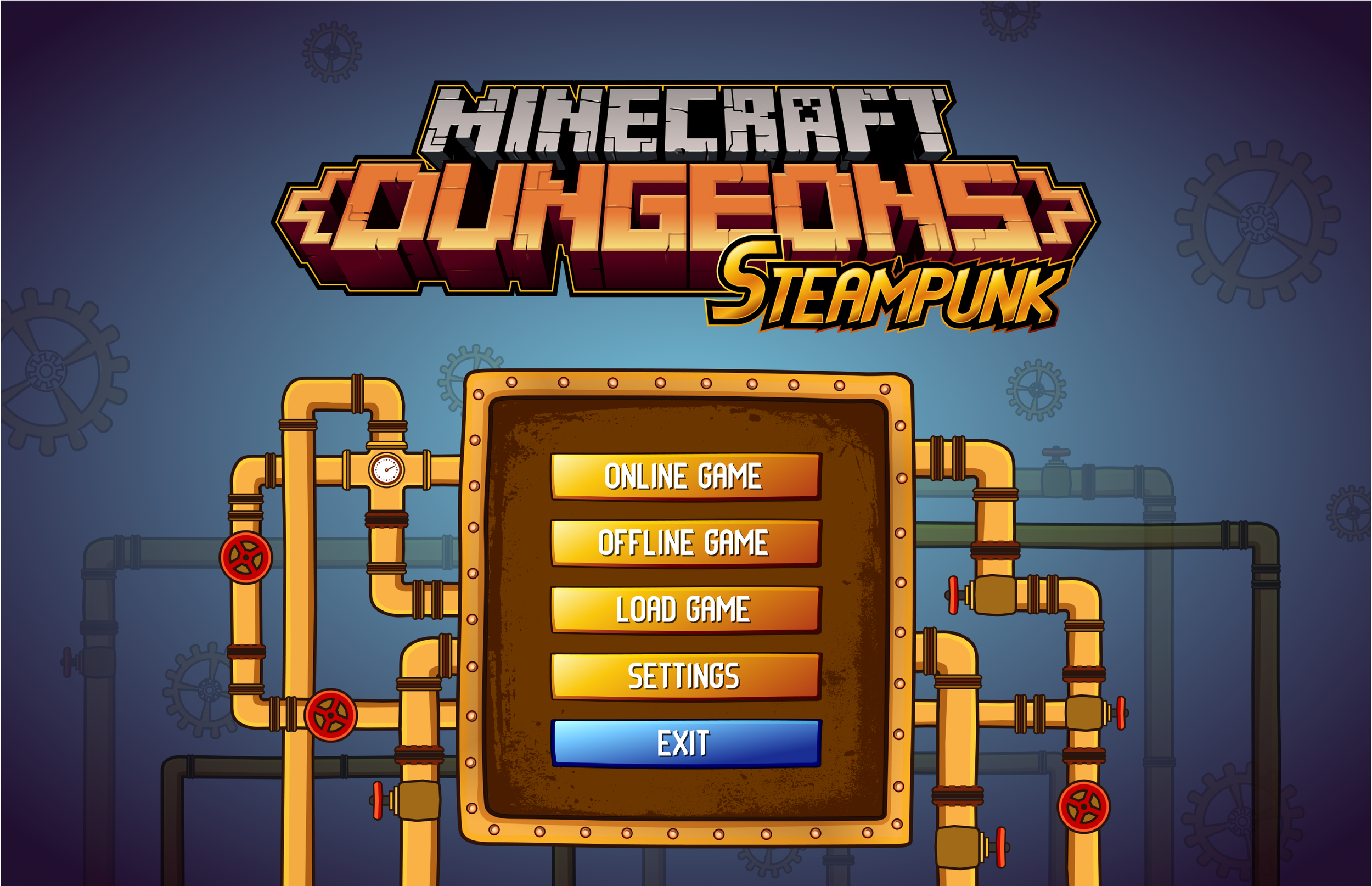
UI Mockups
Length
Feb. 2023 - Apr. 2023
Tools
Photoshop
Illustrator
Figma

Challenges
Thinking about game mechanics through the player’s point of view, understanding player’s emotions.
Creating the wireframes based on an already polished game.
Planning and executing usability test.
Designing a UI Mockups using UI assets that I created.
Work Process

Player Journey
During the initial phase of the design, the game plan was segmented into various scenarios. These scenarios and their corresponding settings were closely examined to comprehend the emotional responses and actions of the players throughout the game. The objective was to offer players a wider range of choices to augment their overall gaming experience.

Usability Test
My next course of action was to conduct a usability test and gather feedback from volunteers.

Research Objectives
The goal was to test the efficiency and learnability of the flows. (PC version)
Assessing efficiency - Are users able to find what they need quickly and easily?
Assessing learnability - Are users able to understand all the options available to them, and are they able to execute on the options available to them?
Research Logistics
Recruitment
Target audience consist of avid gamers.
Age 20 to 40, female and male.
Users own or play games on Nintendo, Playstation, PC, Xbox console.
Players have to had played a video game at least once in the last 6 months.
2 - 3 testers.
Task Design
Go through 6 wireframes (Home screen, Character screen, Location screen, Gameplay screen, Gameplay menu screen, Inventory screen).
Talk out loud all options they have & what does each option mean to testers (before actually play).
Schedules
2 participants
Individual sessions
Duration - 15 mins
insights
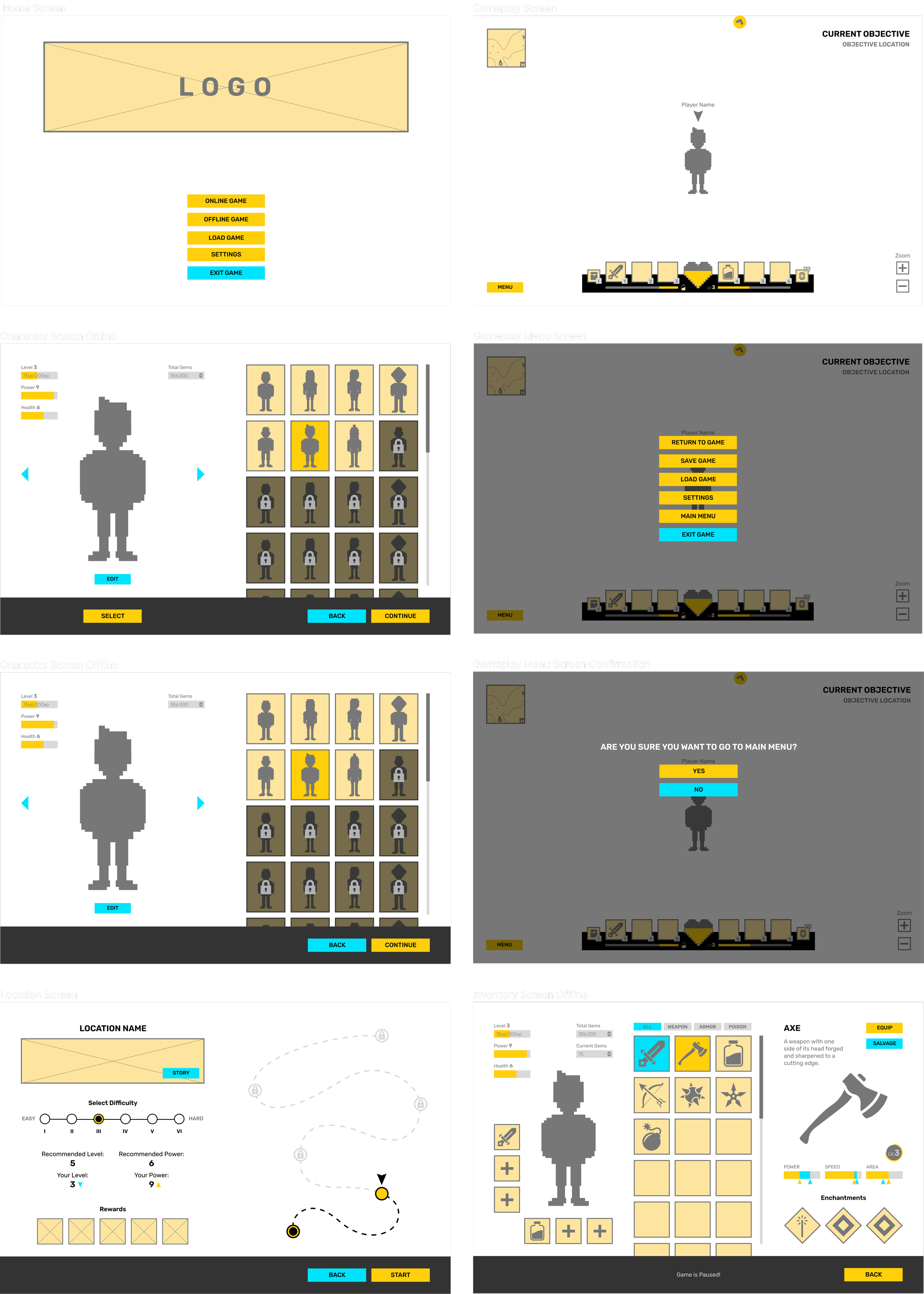
Both participants were satisfied with learnability and efficiency to find what they need. While only Location Screen remained untouched, here are some changes that were suggested from the participants and how I incorporated them into the new wireframes of the screens:
Home Screen:
Add “Load game” button so player has the option to play previously saved game.
Character Screen:
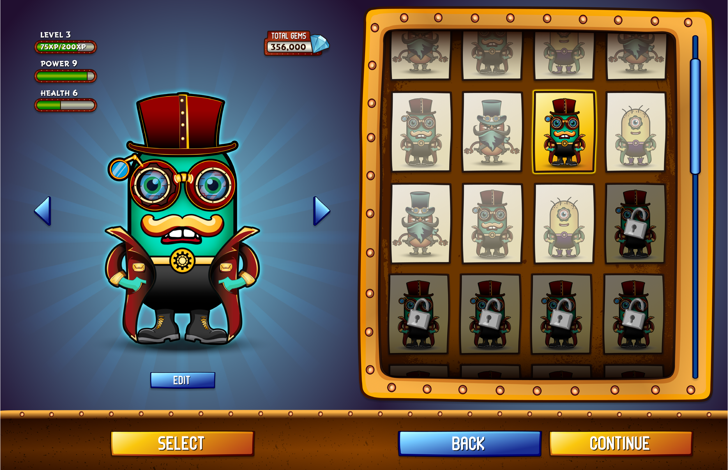
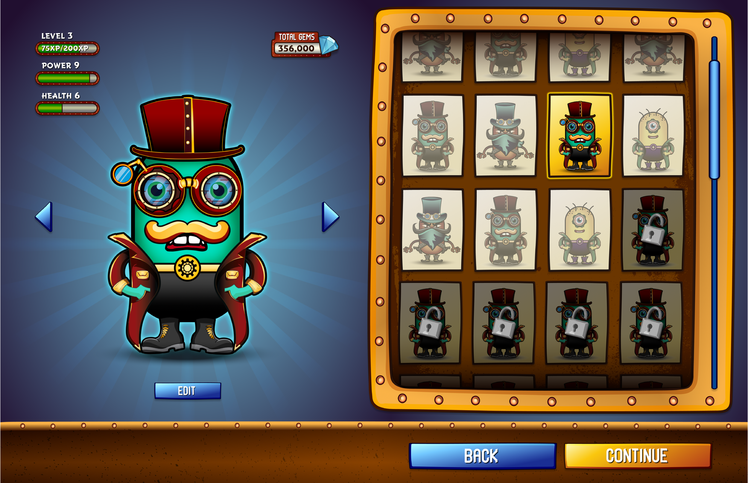
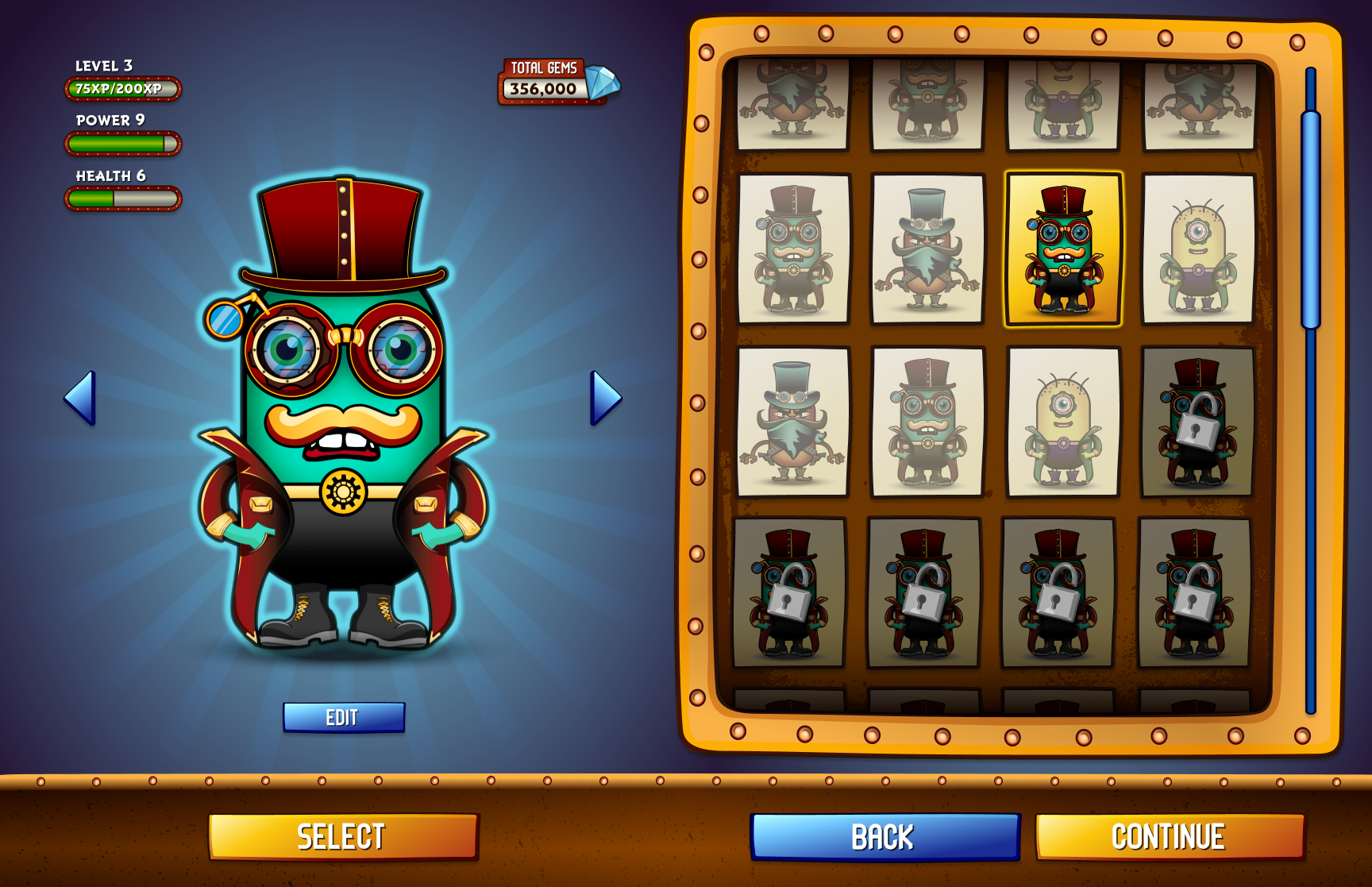
Add lock icon to avoid confusion about locked and unlocked characters.
Rename “Gems” into "Total gems".
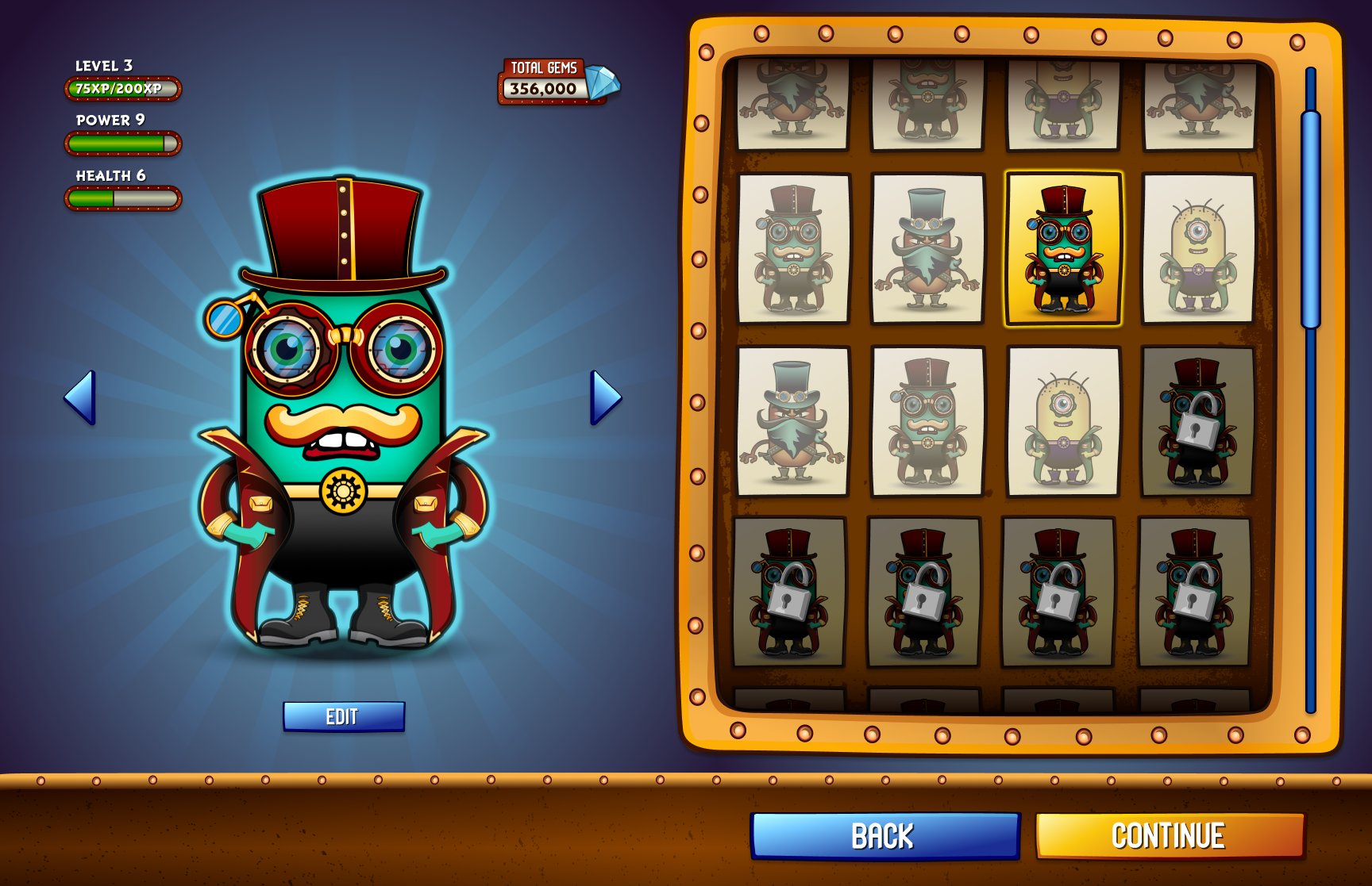
Create Character screen for offline mode. On that page "Select" button is not necessary. Its purpose is to select character in online mode to inform other players that he's ready.
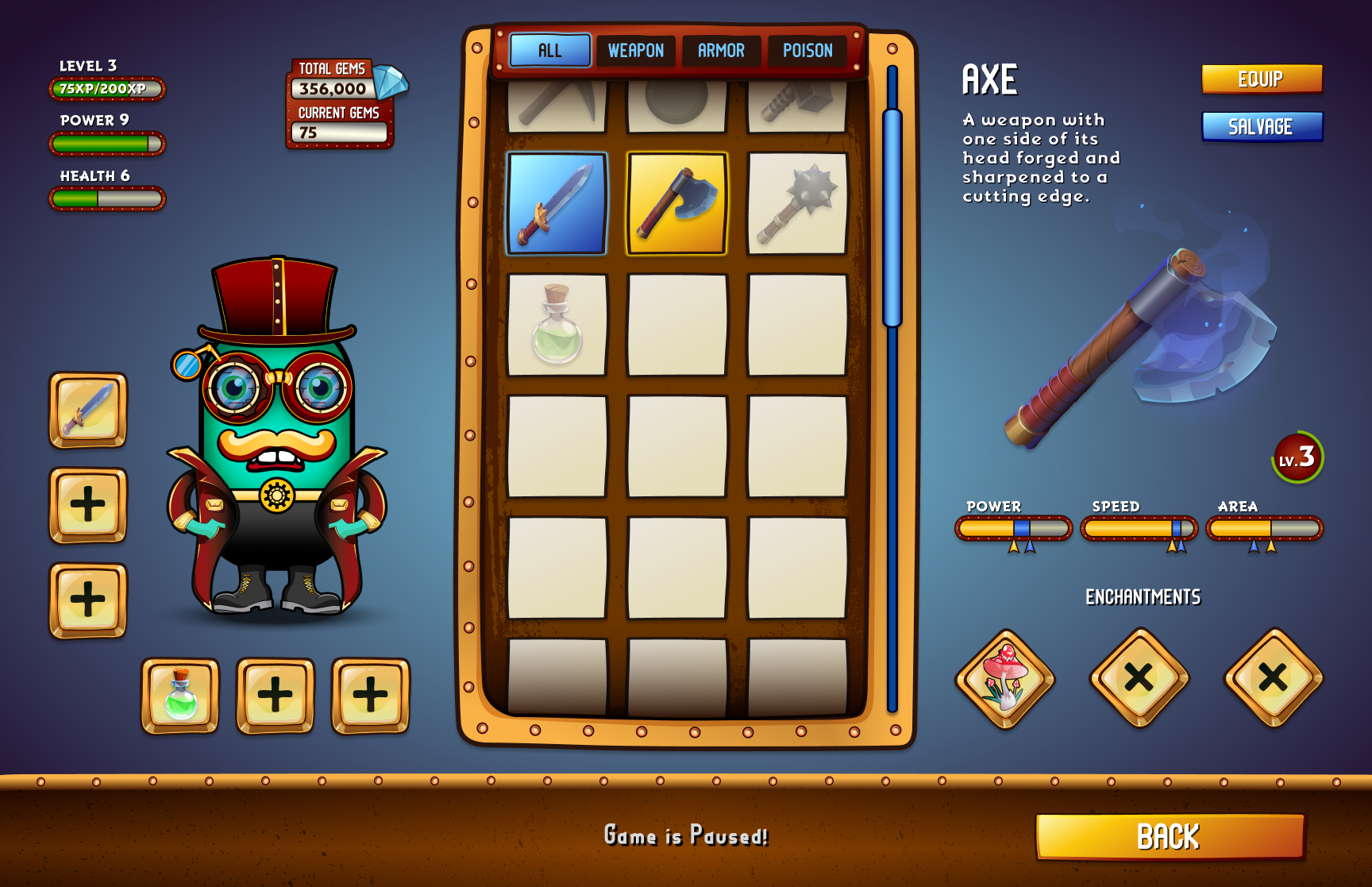
Inventory Screen:
Rename “Continue” into "Back" to avoid confusion.
Add "Equip" button
Add more icons of weapons.
Rename “Gems” into "Total gems".
Add indicator for collected gems in the current mission.
Add level indicator for the weapons.
Add indicators of the enchantments' impact.
Rename "Shell" into "Armor".
Add indicators that game is paused.
Add indicators of comparison.
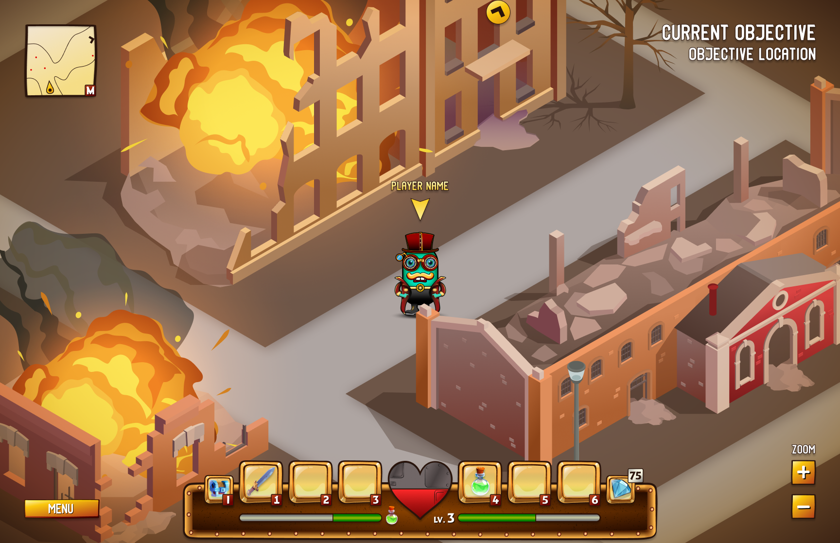
Gameplay Screen:
Add potion icon.
Gameplay Menu Screen:
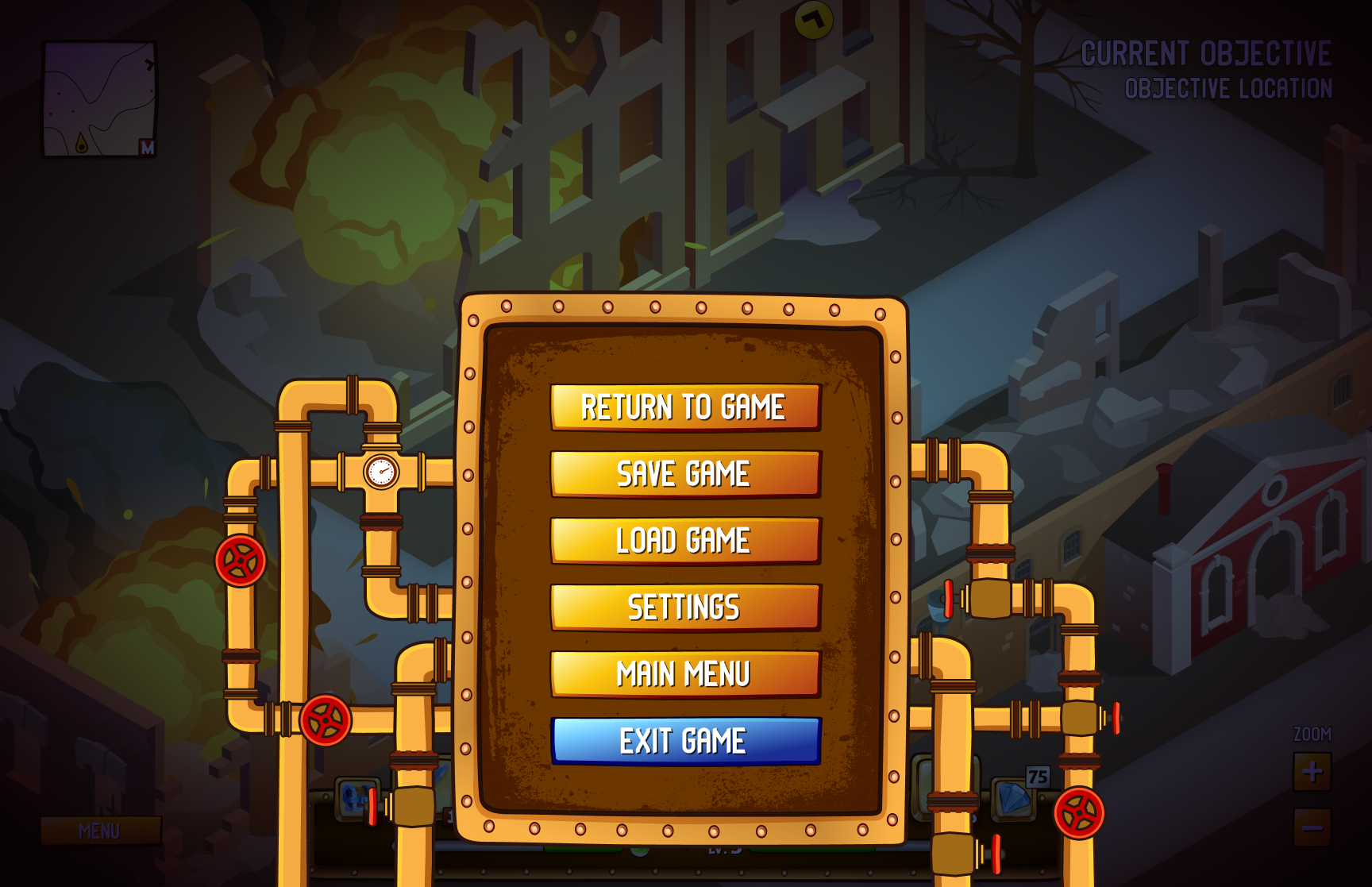
Add “Save game” button so player can save current situation and return to it later if want.
Add “Load game” button so player has the option to play previously saved game
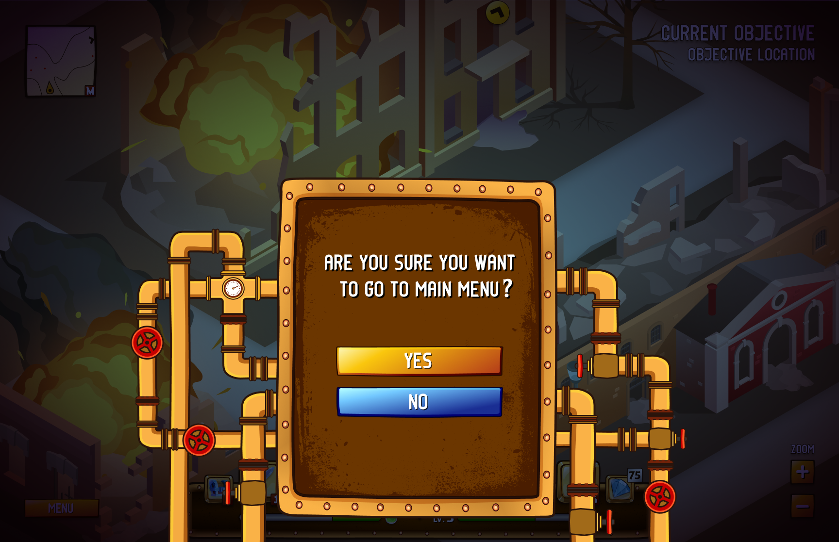
Add confirmation when want to exit game so player doesn't get frustrated if accidentally exit the game.
Iterations


UI Moodboard
As a casual game designed for leisure time, this game requires a high level of clarity and simplicity. However, I also aimed to incorporate some Steampunk elements and atmosphere. To achieve the desired visual feel for the game's interface, I created a UI mood-board.
Clarity - Accessible - Engaging - Desirable - Fun

UI Style Guide
To achieve a cohesive and consistent design for a game's interface, a UI style guide is an essential resource. It includes detailed information on typography, iconography, button styles, and other design elements.
Text Styles


Button Styles
Other buttons

Icon & Art Asset Styles
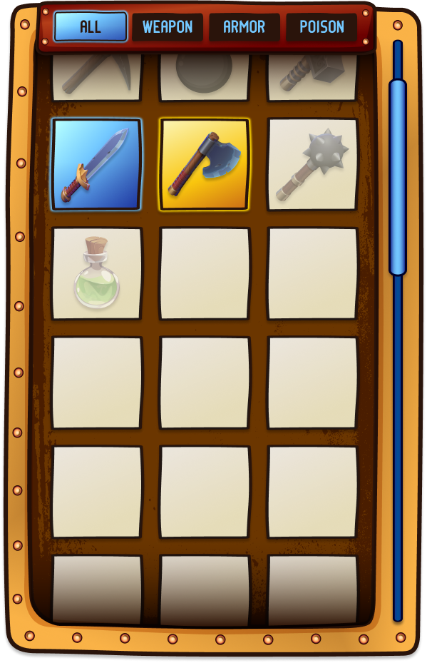
Inventory Selector
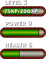
Indicators



Gameplay Menu
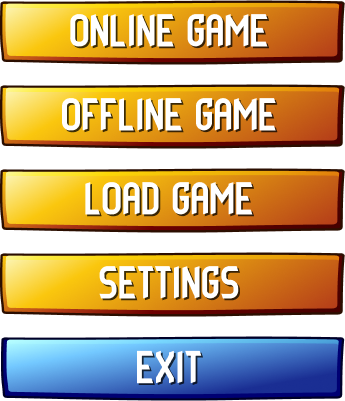
Main Menu

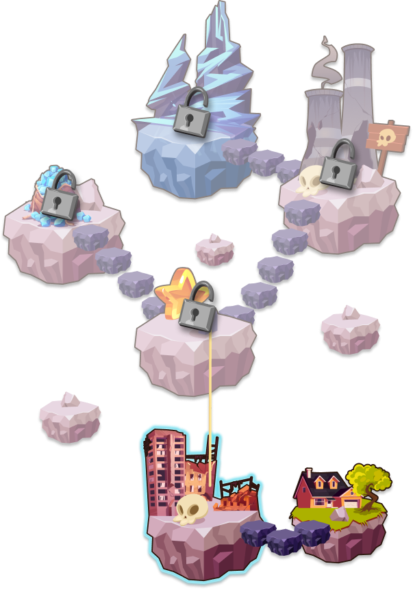
Map
Selected

Menu dashboard
Inventory


Character Selector
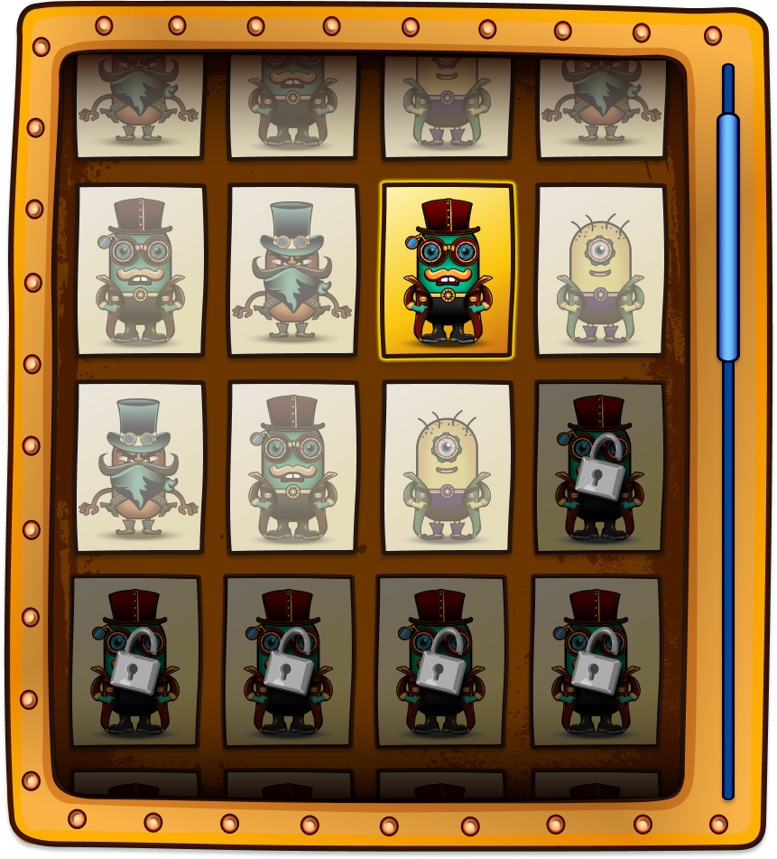
Unselected Character
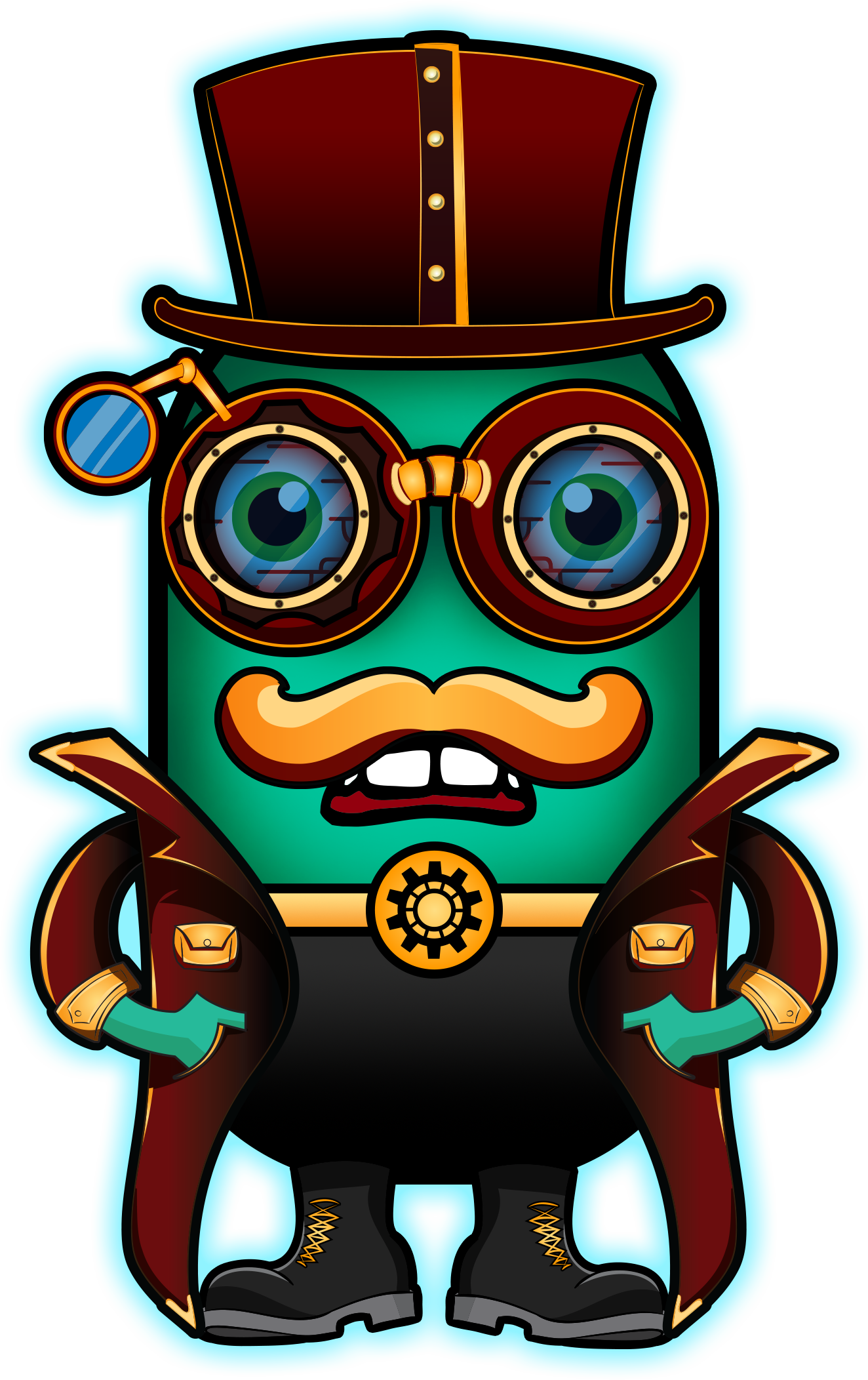
selected Character

Dashboard

Story Preview

Difficulty Selector


Accessibility
While designing this game I wanted to be sure I am meeting accessibility requirements so even people with various disabilities can access and play the game.
Problem
Character Screen
Glow around selected character is barely visible. (Monochromacy/Achromatopsia, Blue Cone Monochromacy, Red-Blind/Protanopia, Green-Blind/Deuteranopia).
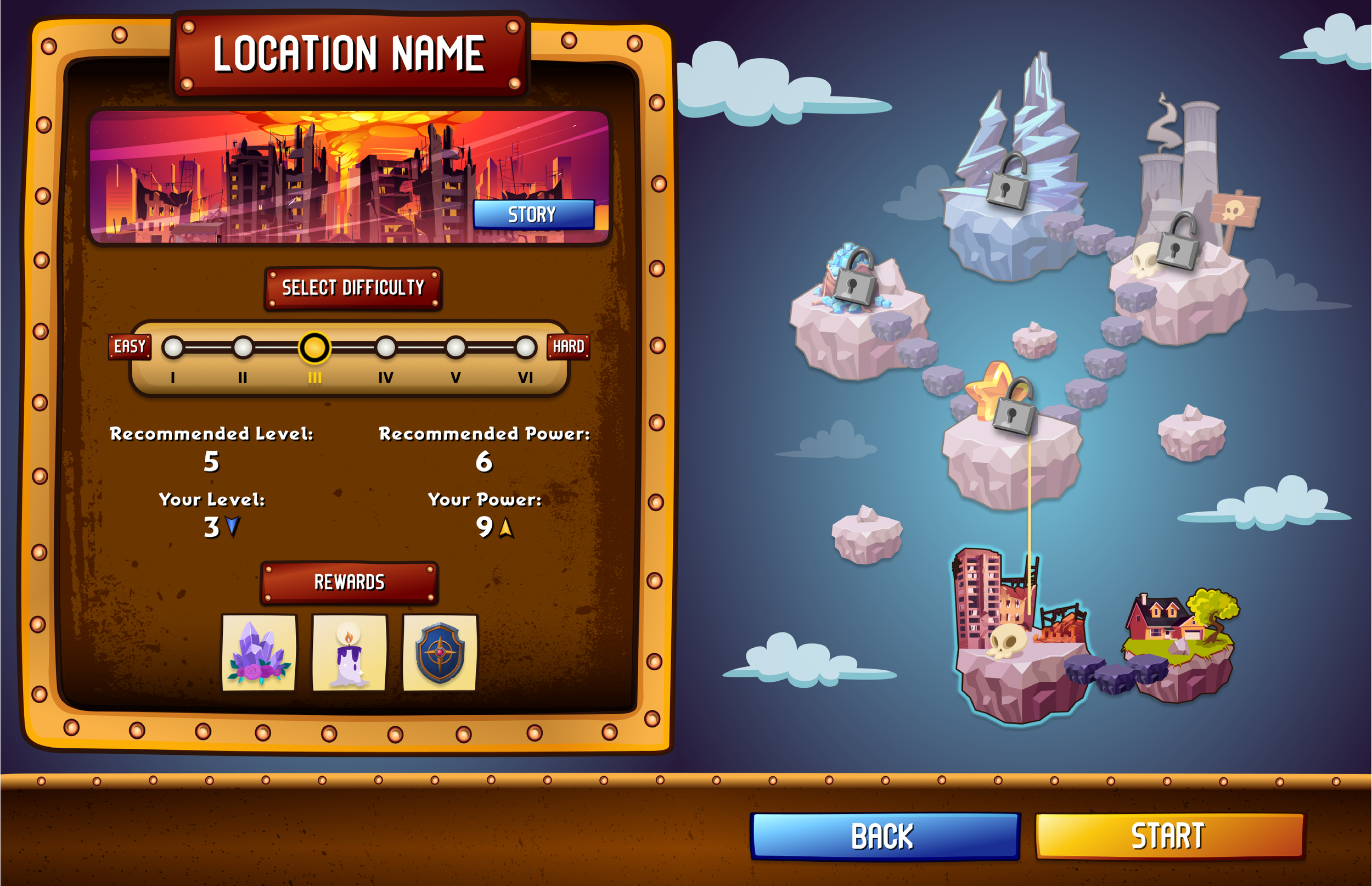
Location Screen
Selected difficulty is not visible enough. (Monochromacy/Achromatopsia).
Gameplay Screen
Health status is hardly visible. (Monochromacy/Achromatopsia).
Inventory Screen
CTA buttons for inventory sections are hardly visible. (Monochromacy/Achromatopsia).
Solution
Adjust the color contrast by expanding the gap between light and dark hues to help the player receive more informative feedback from the game.
In this step I have used a color-blind simulator (https://www.color-blindness.com/coblis-color-blindness-simulator/) to evaluate the accessibility of the UI mockups. It helped me understand how people with vision impairment perceive the different colors during the gaming.

Revised UI Mockups
Conclusion
Throughout the duration of this project, I was tasked with understanding player’s emotions, creating a visual representation of a game’s structure, and create my own interaction of the game’s wireframes. The outcome of all of this is a brand new UI style guide and mockup.
In my opinion, the project was a success and there is room for further exploration of the UI design for this game. The process resulted in a polished mockups, and I'm excited about the possibility of working on similar projects in the future.
