
Netflix - info+
Feature Integration for a Mobile App

Project Overview
Background
Netflix is one of the world's leading entertainment services with 222 million paid memberships in over 190 countries enjoying TV series, documentaries, feature films, and mobile games across a wide variety of genres and languages. Members can watch as much as they want, anytime, anywhere, on any internet-connected screen. Members can play, pause and resume watching, all without commercials or commitments.
Netflix can be accessed via web browsers or via application software installed on smart TVs, set-top boxes connected to televisions, tablet computers, smartphones, digital media players, Blu-ray players, video game consoles, and virtual reality headsets.
Goals and Objectives
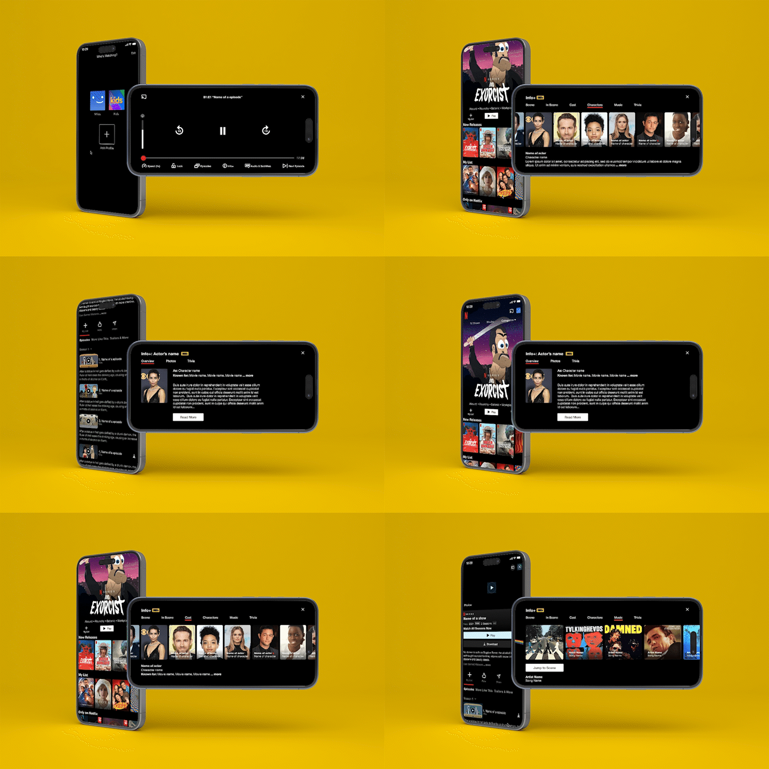
The main goal of this project is to add a new feature that will provide more information about the content that users are watching (movies or series). In that order, my goal is to design a feature that would ultimately allow the users to access information about the actors in a scene, the musical soundtrack, trivia, etc. For creating the high-level design, I am aiming to identify which information users want to be provided while watching and how they find this feature useful for this app.
Understand how users would interact with new features.
Increase potential viewership among movie/show enthusiasts.
Design the feature for other devices.
Conduct usability testing with new features.
Problem
This feature would answer customer’s questions like “Who is that actor?” or “What’s that song?” while giving fans a way to dive deeper into their favorite movies and series by exploring actor bios and filmographies, "Did you know" facts and trivia, character backstories, photo galleries, and bonus video content. You don't need to scratch your head and wonder, "Where have I seen that actor before?". You don't need to get your phone out to Shazam the soundtrack. It is supposed to be all available in a few clicks or taps.
Role
UX/UI Designer
Researcher
Quality Assurance
Tools
Adobe Illustrator
Adobe Photoshop
Figma
Procreate
Team
Milos Panovic (Myself)
Misha Banner (Design Mentor)
Duration
4 Weeks (80 Hours)
Design Thinking Process Overview
Research
Research Plan
Secondary Research
Market Research
Competitive Analysis
Personas
Primary Research
User Interviews
Define
User Persona
Brainstorming
Task Flow
User Flow
Design
Low-Fidelity wireframeUI KitHigh-Fidelity wireframe
Test
Hi-Fidelity Prototype
Usability Testing
Affinity Map
Priority Revisions

Research
In this phase, I first learn and identify the consumers, the business environment, the competitors, and market trends and empathize with potential users that will use new features. Before I began my research, I drafted a research plan that outlines our research goals, research questions, assumptions, and methodologies.
Research Goals
I want to know if additional features such as Info+ that would provide additional information regarding movie/show scenes, actors, soundtracks, etc can be helpful to Netflix's users. I am also interested in what kind of information users would like to see on the new feature. So, regarding that, my participants need to be of different ages, occupations, or different levels of how much they are into movies/shows.
Research Methodologies
Competitive Research Analysis
To investigate and see how the direct and indirect competitors show their users the movie's info while it is playing.User Interviews
To get a better understanding of what kind of information users want to see on this feature and understand their pain points, and aspects they like about the feature. How to organize the media control bar and which icon/symbol to use that the users can easily associate with the movie info feature.User Testing
Create a prototype using wireframes to determine usability and if this new function can aid in satisfying user needs.
Target Audience
Netflix users who are movie/show enthusiasts and lovers and would like to be more informed about certain scenes while watching them.
Competitive Analysis
By observing Netflix’s direct and indirect competitors, I was able to observe what other streaming services have to offer as a solution for additional information during watching a movie/show. By identifying its strengths and weaknesses, I was able to evaluate how Netflix could have an edge in the market.
By creating provisional personas based on market research, I was able to narrow down the type of participants I would interview.
*Click on picture to see it bigger.
Individual Interviews
Individual interviews allow me to probe their attitudes, beliefs, desires, and experiences to get a deeper understanding of the users who come to the site. We can also ask them to rate or rank choices for site content. These interviews can take place face-to-face, by phone or video conference, or via an instant messaging system.
Demographics
Ages: 24 - 45
Number of participants: 5
Research Analysis
*Click on picture to see it bigger.


Define
After synthesizing data from the research phase, I define the feature that can core solution for the users’ curiosity regarding additional information about a certain movie or show. While defining, I will Ideate by generating new ideas and brainstorming how to initially create the site architecture and solve the problems of the product.
User Persona
After gaining the feedback from my user interviews, I created key user representatives with the characteristics that all interviewees share, which are my personas Richard May and Becky Watcher.
*Click on picture to see it bigger.
User Flow
To understand the various ways users can interact with Netflix’s new feature, I created a user flow portraying my user personas, in different scenarios. This allowed me to observe different pathways users can take on Netflix depending on the decisions they make. Again, this helped me highlight key screens to design for users to meet their goals.
*Click on picture to see it bigger.

Design
In this phase, I want to start creating the design layout of my pages, the UI elements and components it needs, and define the visual elements that will go into it.
Low Fidelity Wireframes
Referring to Netflix’s sitemap, flows, and competitor websites, I sketched out the wireframes on each page of the app. These low-fidelity wireframe sketches allowed me to quickly lay down my ideas and observe the structure, hierarchy, and layout of each screen before adding any content.
*Click on picture to see it bigger.
High-Fidelity Wireframes
My designs came to life in high-fidelity wireframes. I designed Netflix’s existing screens by using screenshots from my iPhone. I made sure to follow Netflix brand guidelines as I added the new feature to ensure that the new feature would not disrupt the current user experience.
*Click on picture to see more.
UI Kit
After creating the high-fidelity designs, I created an updateable UI-Kit to compile all the UI elements, features, patterns, and assets into one guide as I build through the screens.
High-Fidelity Prototype
With my high-fidelity wireframes ready, I created a functional prototype in Figma in order to prepare for usability testing. This prototype would allow me to observe how users interact with my designs before the new feature is launched.

Test
In this phase, I have created a prototype design to conduct usability testing with real users to see if the screens function as intended. This will allow me to weave any potential user difficulties, usability errors, or false assumptions that the prototype may have so I can iterate on the updates and prevent over-investing before the actual site development.
Usability Testing
Before conducting the usability test, I created a usability test plan to outline all necessary guides to convey to our participants.
Overview:
Usability testing was conducted with 5 participants in total, 3 Males and 2 females, ranging from ages 17 to 51. The moderated in-person think-aloud usability tests lasted approximately 5 minutes each. I informed all participants that we would test a new feature on Netflix’s mobile app. I gave them 3 tasks to complete on Netflix’s prototype and asked them to walk me through what they were doing out loud. As users carried out these tasks, I documented their actions, comments, and questions. I asked clarifying questions throughout the sessions when necessary. Usability testing allowed me to uncover user pain points and make improvements to Netflix’s new feature.
Completion Rate:
All participants completed all tasks 100%.
Error-Free Rate:
The Error-Free rate for all given tasks is at 100%
Affinity Map
I have created an affinity map to visualize behavioral patterns and other observations made from all the written notes in our usability findings into different categories. This method helps me gain insight into common usability errors and design recommendations that can be used to make improvements to Netflix's new features.


